
Why Your Business Needs a Mobile Website Right Now

First, the good news: If you have a website, then you have a site that can be accessed by any mobile device with a browser. Now, the bad: Chances are, that site looks pretty crappy on said mobile device.
If you’re worried about this, you’re not alone. Just as companies realized, circa 1996, that they needed to create a website to remain relevant to consumers, history is repeating itself in mobile. By 2013, more people will use mobile phones than PCs to get online, according to Gartner. In mid-2011, we also reached the point at which consumers were spending more time on their mobile devices than on their PCs.
In such an environment, a site designed to be viewed on a desktop PC comes across as woefully lacking. Say you’re accessing such a site from the Safari browser on your iPhone. The first thing you’re likely to notice is that it takes a relatively long time to load. The second thing is that the type on the page is pretty small. It might take a lot of zooming and pinching to navigate the site as well. If you have Flash on your site, it’s not going to come across at all on an iPhone. At that point, your potential customer may start looking around. According to a recent survey from Compuware, 40% of users have turned to a competitor’s site after a bad mobile experience.
Yet currently, most businesses haven’t optimized their sites for mobile. Jesse Haines, group marketing manager for Google Mobile Ads, says the company canvassed its large advertisers early in 2011 and found only 21% have launched a mobile site. If you’re among the other 79% or so, take heart. Optimizing your site for mobile or creating a mobile site from scratch isn’t a big deal.
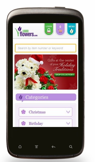
Google’s howtogomo.com is a clearinghouse of information on the topic and even includes a feature that lets you see how your site looks on a mobile device. For those looking, Jesse Wixson, VP of marketing at iTetxUSA, says he thinks the average price for a decent mobile site is more like $900 to $1200. One thing to consider is whether your site is what Wixson calls “thumb-friendly.” What that means in practice is lots of big, fat buttons. Another thing to keep in mind is font size and navigation. The first should be fairly large, and the second should be fairly intuitive. Wixson says one site that renders especially well on mobile is 1-800 Flowers, which, as you see below, is both thumb-friendly and intuitive.
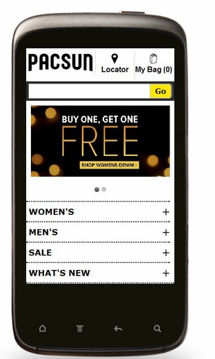
Another site Wixson singles out is from PacSun, the teen-focused clothing brand:
Incidentally, if you’re considering a mobile app rather than a mobile website, Wixson says to go for the website. “It really depends on the brand,” he says. “We think a mobile website is a must-have.” Wixson says that for some brands, like news sites for instance, a mobile app makes sense, but otherwise, most users are going to look for you via their browser.
“If you’re going to search for any type of business, you’re going to search the mobile web, not an app store,” he says. “People don’t look for apps that will give them information.”


Connect With Us!